This is a quick and simple custom I did for the Toyworld Grant figure. I had gotten it at TFCon 2014, and you might had seen in in some of my instagram photos. When I got the figure, snapped a pic and put him in his box. Once I saw there was another version with more paint apps I thought I might end up trading it for the other version. Well time went on, and it seems the market is somewhat flooded with these figures so I decided I will make due with this one.
I was not sure where I was going to begin my approach. I had not seen the character in the shows, so I didn't have any attachments to make it look just like the character. I figured I would add some details based on the colors that exist to see what could improve the overall design.
 |
| The character model for Grand Maximus. |
 |
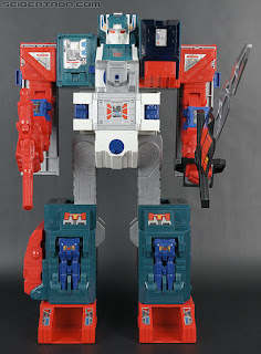
| The original toy thanks to seibertron.com. |
 |
| The original heads bot mode thanks to seibertron.com. |
As you can see in the photo I took they improved the toy some. It isn't a straight Knock Off, but updated, and actually much smaller. So small that it does not have an additional headmaster for the headmaster, and other accessories. It does however have all the modes for transformation, but with added details and articulation. It was a well built figure, but the colors seemed sort of bland.
You can see from the sales photo that it came with stickers, and they add a little to its look, but it is still a little over saturated in these molded colors. I figured I could repaint a lot of the figure, but I am going to see what I can do with it by just modifying the head. The head was mostly a single color, and it made the figure feel lifeless.
I started with adding some color to the head robot itself. I painted his helmet and chest to break up the single molded color. I also added some silver to his face and yellow eyes. It was a bit tricky to paint the face because this figure was so small. More or less it was done with a single bristle brush.
The rest of the helmet was painted with a brush as well. It had to be painted twice because once I moved the finished product into another light I found that this was not a blue as much as it was a blue green tone. It was not too hard to match the paint to the plastic once I saw it closer in the light. I then added some paint below the jaw to give it more shape and painted his face mask & horns silver. I also added a little silver to the gray vents before adding the stickers.
I think compared to the productions photos he looks less like a stone faced statue and has a bit more character. On top of that, he is more toy and character accurate. Check out the rest of the photos of this guy.
Don't forget to follow our instagram, facebook, and twitter fore more news and projects. Thanks for looking.


No comments:
Post a Comment